

Case study
Everyone in the top ten looks equally good. None of them are.
Ten companies from one independent shortlist, each valued on the same basis. The gap between the largest and smallest result is 1,669 times on their own plans, and four different companies come first depending on which impact is measured.
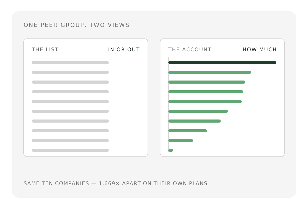
Every top-ten list makes the same quiet promise. So does every portfolio. The promise is that the names inside belong together, that they are a peer group, and that being on the list means something roughly comparable for each of them.
Ten companies from one such list were valued on a single consistent basis this month. On current activity, the gap between the largest and the smallest result is 218 times. On the companies' own five-year plans, that gap widens to 1,669 times. And depending on which impact is being measured, four different companies come first.
The findings have very little to do with the list that was used, or with the sector it covers. They are about what happens to any group of companies once their impact is actually accounted for.
This matters more for portfolios than for lists, because a portfolio is a list somebody has already put money behind. A fund holding ten impact companies is making a claim about all ten at once, and unless the members have been measured against each other, the weighting inside that fund is an assumption rather than a decision. The exercise below tests that assumption on a peer group somebody else assembled, which removes the risk of building a cohort that flatters the conclusion.
Why a list cannot answer the question it raises
Selection is a binary. A company is on the list or it is not, and everyone who makes the cut draws the same attention. That is what makes a shortlist useful, and it is also its limit. A shortlist says where to look, and it is silent on the two things an allocator has to decide. How much, and at what cost.
Scores do not fix this. A single composite score restores an ordering, and it does so by choosing a weighting on the reader's behalf, usually without saying which one. The ordering then looks objective while being a statement about what the score's author decided to care about.
An account behaves differently. It produces results per company in units that can be compared, so magnitude survives, and it keeps the separate impacts separate, so trade-offs survive too. Those two properties are what the rest of this piece tests.
The test case
The cohort comes from the Global Cleantech 100, published by Cleantech Group in January 2026 from a list struck on 30 September 2025. It suits the purpose well. The report is public and recent, it is assembled independently by a 78-member expert panel, and it is deliberately published unranked, in alphabetical order inside six industry groups, with the panel scores withheld. It is also explicit that it represents a view of the next five to ten years rather than impact delivered to date.
Ten of the hundred were selected using only attributes printed in the report itself, specifically industry group, region, year founded, solution type and prominence in the report's own foreword, with no country taking more than three places. No impact data entered the selection, so the cohort was not chosen to produce a particular answer. Each company was then modelled independently in impactaccounting.ai from public filings, company disclosures and sector data, producing 397 impact pathways across natural, human and social capital, with a forward scenario to 2030 built from each company's own disclosed capacity, throughput and headcount plans.
Results use anonymous identifiers from A to J. Nothing here evaluates the panel's judgement, and nothing here is a verdict on an individual business.
Finding one, membership is not performance
All ten create net positive societal value, both in the baseline year and in the central 2030 case, so the selection is not wrong about direction. They are nowhere near each other in size.
On the FY2025 baseline, the largest result is 218 times the smallest. On the companies' own 2030 plans, the spread widens to 1,669 times. Four of the ten land inside a single band at 2030, from just under USD 50 million to USD 66 million, and those four are genuinely comparable to each other. The other six spread from USD 762,000 to USD 1.27 billion, and only two of them are close enough to each other to be worth comparing directly. The median company sits at USD 53.4 million, which makes the top result nearly twenty-four times the middle of its own peer group.
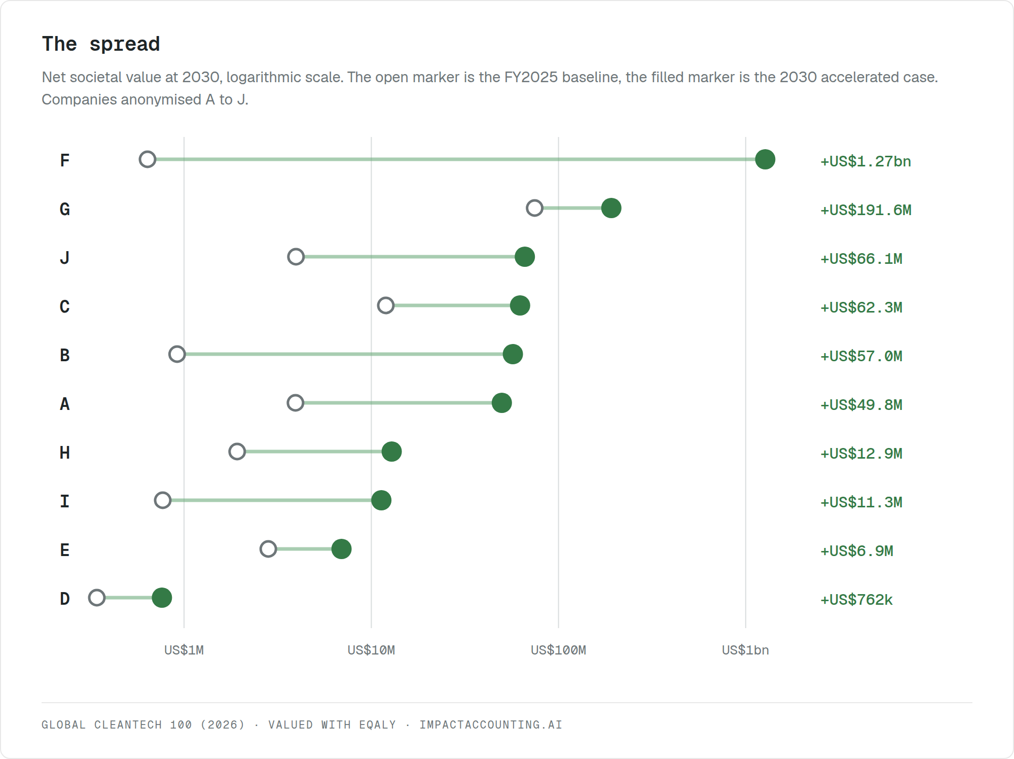
The concentration goes further down than the company level. In the baseline year, a single modelled pathway inside one company carries almost three times the societal value that the other nine companies produce between them. Diligence on that one counterfactual assumption is worth more than diligence on nine businesses.
An equal-weight position across this peer group would put ninety per cent of the capital behind 27 per cent of the impact recorded in the baseline year. That is not a criticism of equal weighting. It is what equal weighting does when the members are three orders of magnitude apart and nobody has checked.
Finding two, the future is where the ordering really breaks
Eight of the ten produced less than USD 4 million of societal value in the baseline year and two had effectively no revenue at all, so for most of this cohort the trajectory is the asset rather than the current result. That makes the forward view the more decision-relevant one, and it is also where the ranking becomes least stable.
Seven of the ten change rank between now and 2030. One moves from ninth place to first, because its 2030 result comes almost entirely from production capacity licensed to third parties rather than plants it operates itself. Measured today it looks like a modest employer. Measured on its plan it produces the largest single result in the cohort. Neither number is wrong, and only one of them is an investment case.
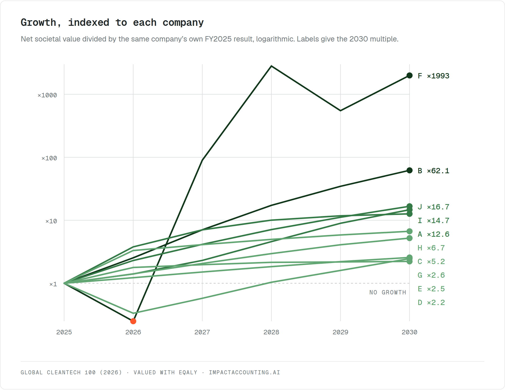
Indexed to their own starting point, the cohort spreads across almost three orders of magnitude of growth. One company multiplies its present societal value nearly two thousand times, because it is starting from almost nothing. A second grows sixty-two times. Three grow between twelve and seventeen times, two grow five to seven times, and the remaining three roughly double or a little more. Growth potential and current size are close to unrelated in this group, which means a screen run on either one alone selects a different portfolio.
Every projection also carries a range, because each company was modelled with a risks case and an opportunities case alongside the central one. For most of these companies that range is wider than the gap to their nearest neighbour in the ranking. At the extreme, one company's opportunities case is twenty-three times its risks case, on the same assets in the same year. Ranking a cohort like this on a single 2030 point estimate is ranking execution assumptions rather than companies, and the honest presentation is the band rather than the point.
Finding three, there is no single ranking
Rank the same ten companies on ten separate impact dimensions, covering climate, air quality, biodiversity, land use, water pollution, water use, jobs and wages, health and wellbeing, public finance, and total societal value, and the orderings do not agree with each other. Four different companies take first place. Half the cohort is simultaneously top-three on one dimension and bottom-three on another. The median rank correlation between any two dimensions is 0.31, and the widest disagreement is negative, at minus 0.42 between jobs and wages and public finance.
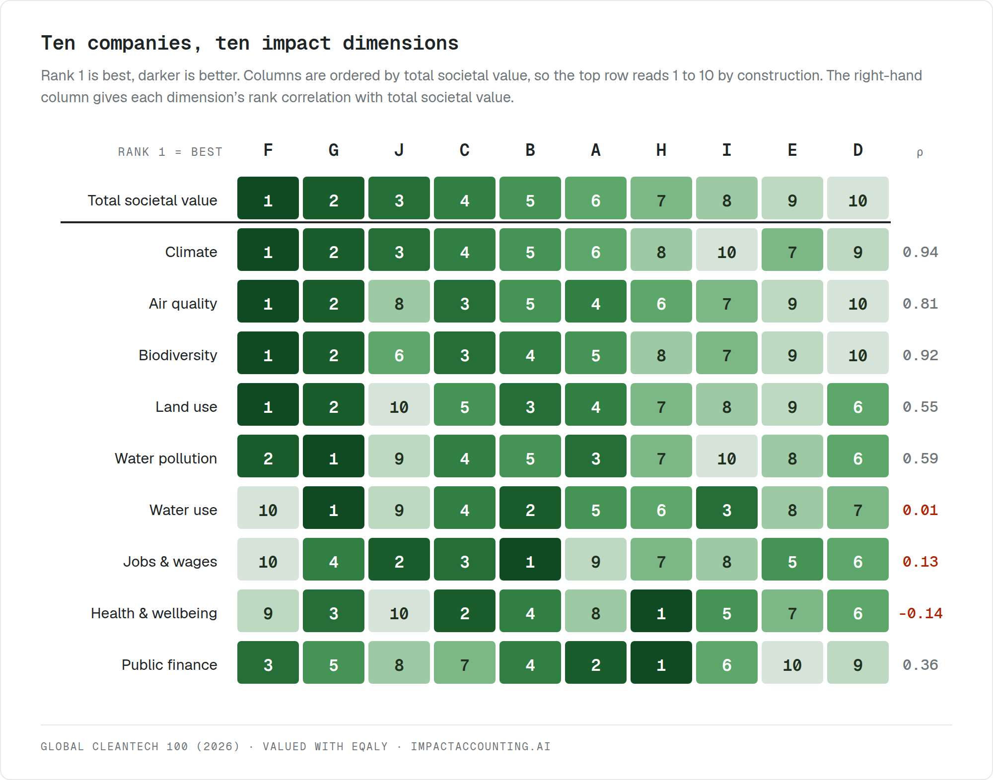
Spread across those ten dimensions, the top position is held by four different companies. One takes it on climate, air quality, land use and biodiversity. A second leads on water use and water pollution. A third leads on jobs and wages. A fourth leads on both health and wellbeing and public finance, despite ranking seventh on total societal value. Each of those four could be described, accurately and in good faith, as the strongest performer in the cohort.
Carbon is the exception that explains why the problem is so easy to miss. Ranking on CO2 avoided reproduces the total societal value ordering almost exactly, with a rank correlation of 0.94. A carbon screen therefore feels reliable, because in a cohort like this one it usually puts the right company near the top. What it cannot do is say how much, and it quietly settles questions it was never asked. Water use correlates with total societal value at 0.01. Health and wellbeing correlates at minus 0.14, meaning the companies creating the most societal value overall are, if anything, slightly worse on health than the ones creating the least.
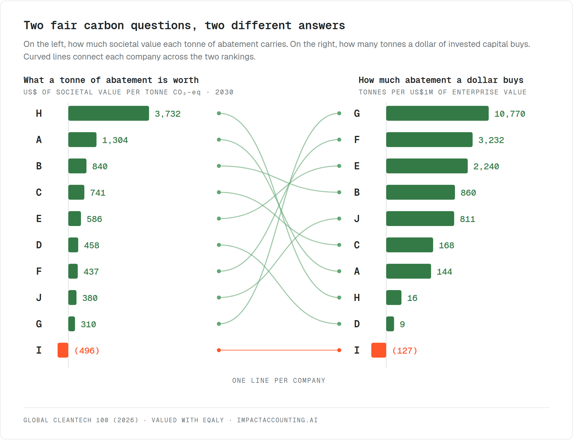
The same effect shows up inside carbon itself. Ask how much societal value each tonne of abatement carries and one ordering appears. Ask how many tonnes a dollar of invested capital buys and a different one appears. Both are reasonable questions, both are about carbon, and the two orderings correlate at minus 0.15, which means they are almost unrelated. An investor optimising for cheap tonnes and an investor optimising for valuable tonnes end up with different portfolios.
The individual cases are where this becomes concrete. One company ranks first on climate, air quality, land use and biodiversity, and last on both water use and jobs, because the process at the centre of it is very water and power hungry and employs comparatively few people for the output it produces. Another ranks second on jobs and last on health, because its product puts more riders on the road and road injuries are a real cost that its own model carries. A third is still a net carbon emitter in 2030 and is nonetheless a substantial creator of natural capital, because its net air pollution benefit at 2030 is roughly USD 10.6 million, comfortably larger than the USD 3.9 million of climate harm it carries.
None of these is a contradiction, and none is an argument against the companies involved. They are what trade-offs look like once somebody measures them.
Finding four, the trade-off is the decision
Every clean technology carries a bill, made up of electricity, purchased inputs, hardware and the costs it pushes onto the customers who adopt it. Gross benefit is the number companies report, and what survives their own harm is the number that matters.
Summed across the ten, harm scales more than three times faster than benefit, and what the cohort retains of its gross benefit falls from 93.8 per cent today to 79.8 per cent at 2030. That aggregate is partly a composition effect. One company enters at industrial scale during the period and ends up carrying 80 per cent of all the destroyed value in the cohort, so the cohort figure moves largely because of it. Per company the picture is steadier, with the median retention roughly flat and four of the ten deteriorating.
What does hold across almost all of them is the mechanism. The largest destroyer of value in 2030 is not their supply chains and not their purchased inputs. It is energy, at 89.3 per cent of destroyed value across the cohort, split between the power their own products draw in their customers' hands, at 49.3 per cent, and the power their own processes draw, at 40.0 per cent. That headline is dominated by the largest company, so the more useful version is the per-company one. Energy accounts for more than a third of destroyed value in nine of the ten, and more than half in six of them.
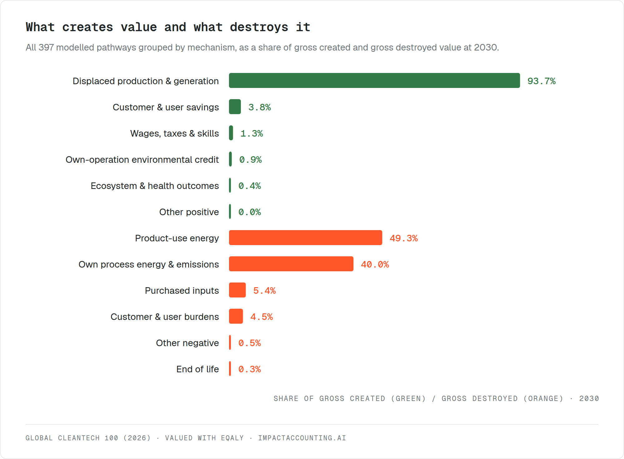
These are companies whose entire proposition is decarbonising something else, and by 2030 their largest liability is a grid none of them controls. The important part is that the dependency is not concentrated in one name. It shows up independently in nine of the ten, in businesses that share no technology, no customer and no supply chain. That is what makes it a correlated exposure across a set of holdings that looks diversified. Diversifying across ten companies that decarbonise ten different things does not diversify the pace at which the power sector cleans up.
One company shows what happens when the ratio moves the wrong way. Its harm rises sixtyfold against a tenfold rise in benefit, so it ends 2030 keeping nineteen cents of every dollar of benefit it creates, and five years of successful scale-up add about USD 420,000 of net societal value. The technology works. The energy it consumes to work cancels almost all of it.
Who actually leads, on one particular ordering
Since the whole argument is that the ordering depends on the question, it is worth naming one ordering explicitly and being clear about what it does and does not mean.
Ranked on societal return, meaning net societal value per dollar of projected 2030 revenue, the five strongest performers in the cohort are these.
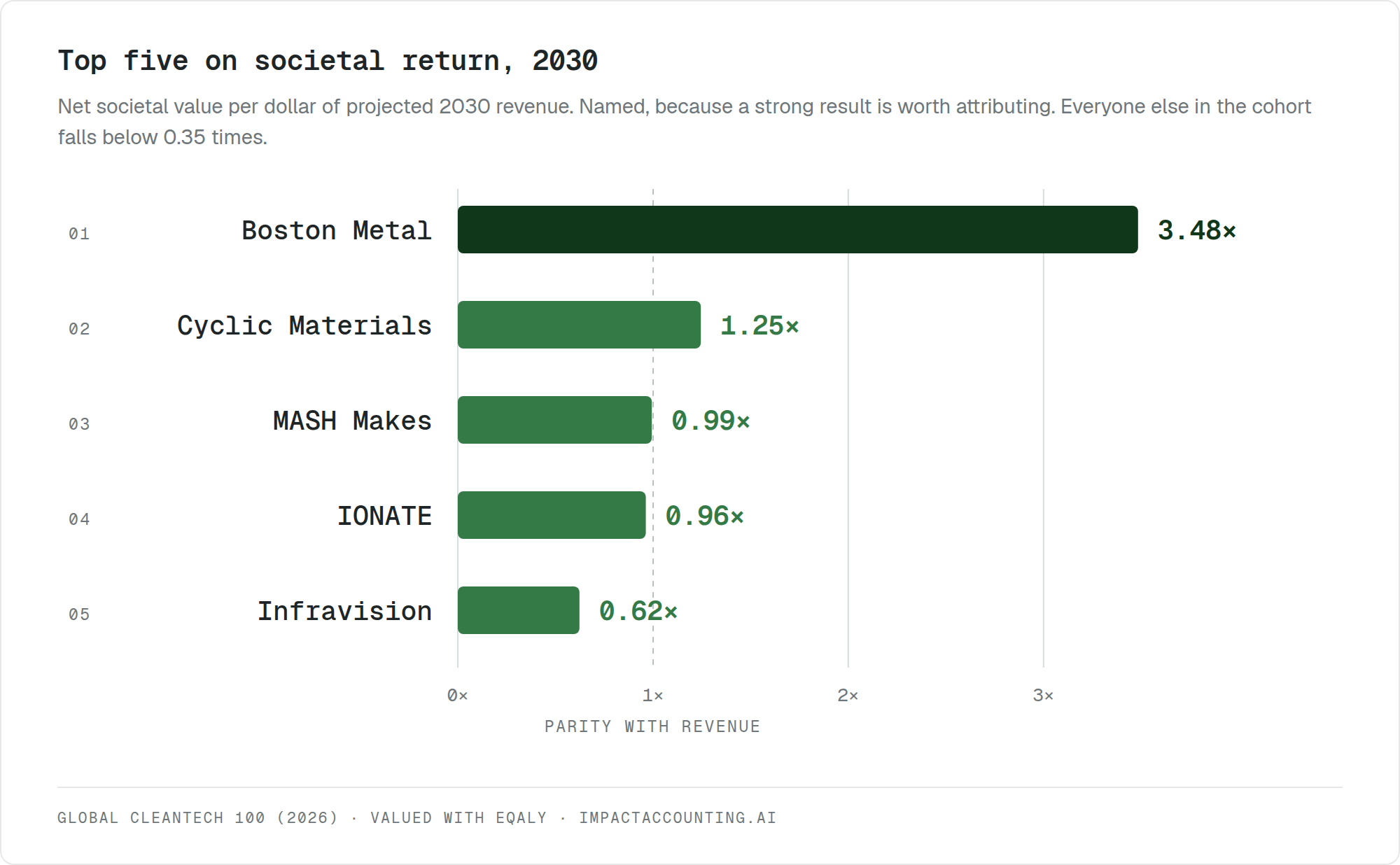
This measures how much societal value each dollar of business activity carries, which is a useful thing to know and is not the same as how much societal value a company produces in total. The two orderings do not agree. One company sits near the top of the ratio ordering and well down the absolute one, because it is small. Another produces one of the largest absolute results in the cohort and falls outside the top five here, because its projected revenue base is very large relative to the value it creates. Ratios reward efficiency and hide scale. Absolute figures reward scale and hide efficiency. Both are correct and neither is sufficient on its own, which is the point of keeping them separate rather than blending them into a score.
The denominator was tested rather than assumed. Revenue is not the only sensible base, and impact per dollar of capital invested is arguably the more natural question for an investor. Computed for the eight companies in the cohort that disclose invested capital, the same five lead on both, in a slightly different order. Impact per dollar of enterprise value produces a different leader altogether. Three defensible denominators, two agreeing on the leading group and one not, is the same lesson as the ten dimensions in a smaller frame.
Five things an investor can do with this
The findings above are only useful if they change something on Monday. Each of the following can be applied without adopting any particular valuation method, and each becomes sharper with one.
Establish the spread before treating a shortlist as a peer group. Ask what the ratio is between the largest and smallest contributor inside the group on whatever impact metric matters most. If nobody can answer, then the weighting is an assumption. Without a full account, a workable proxy is to ask each company for its single largest impact driver in physical units, such as tonnes displaced, megawatt-hours avoided or people served, and compare those directly. In this cohort the honest answer was 218 times on current activity and 1,669 times on plan.
Name the impact priorities before ranking anything. If four different companies can come first depending on the dimension, then choosing the dimension chooses the winner. Write the mandate's priority order down first and rank on each dimension separately, rather than blending them into one composite. Blending is not neutral, it simply moves the decision somewhere nobody can see it.
Find the one assumption the thesis rests on. Impact value concentrates far more than revenue does. Here a single pathway inside one company carried more than the other nine companies combined. For every holding, ask which counterfactual the impact claim depends on, who validated it, and what happens to the claim if it is half right. Then size the diligence to the concentration rather than to the cheque.
Test whether growth helps or hurts. Harm elasticity, meaning how fast a company's own footprint scales relative to its benefit, separates a company worth funding to scale from one worth funding to fix first. Four of these ten see harm grow faster than benefit between now and 2030, and in two cases the gap is wide enough to consume most of the gain, with one gaining almost nothing from five years of successful execution. A rough version needs no valuation at all. Compare projected growth in energy and materials consumption against projected growth in output. If the first is faster, the impact case weakens as the company succeeds.
Look for the dependency the whole portfolio shares. Ten unrelated technologies turned out to share one exposure, the speed of grid decarbonisation, which by 2030 drives the largest single source of destroyed value in nine of them. Ask what every holding depends on that none of them controls, and stress-test that variable across the portfolio rather than company by company. Correlated impact risk behaves exactly like correlated financial risk and is far less commonly checked.
The practical test underneath all five is short. If two names in a portfolio cannot be compared on magnitude, and if the ordering flips when the metric changes, then that portfolio has not been measured. It has been selected. Those are different things, and only one of them supports a decision.
Method and limits
Ten companies from the Global Cleantech 100, 2026 edition. Each modelled independently using the eQALY framework, which converts physical and social outcomes into a common monetary unit by way of equivalent quality-adjusted life years, producing 397 pathways and 1,070 variables across three capitals. All valuation outputs are in USD. Monetary capitals follow the impact accounting convention where positive means beneficial, while physical indicators follow the GHG Protocol convention where positive means emitted. In the ten-dimension ranking, physical dimensions are expressed as burden avoided, so higher is better in every row. Figures are per company and unattributed, and nothing is summed into a portfolio, because these ten would never sit in one.
FY2025 is the modelled baseline and 2030 comes from a separately computed accelerated scenario per company, driven by that company's own disclosed capacity, throughput and headcount plans. The two horizons are alternatives and are never summed. Where a spread or a ratio is quoted, the horizon is stated, because the two differ substantially and the 2030 figures depend on execution that has not happened yet.
Societal return here is net societal value divided by projected 2030 revenue, both flows in the same year. An impact multiple of invested capital was considered and not used as the headline ratio. Two of the ten disclose no invested capital, so it cannot be put on a consistent basis for the whole cohort, and dividing one year of societal value by a cumulative stock of capital compares a flow to a stock, which grows with every year the company operates rather than measuring anything about the company. Where invested capital is disclosed it is used as a robustness check rather than as a ranking.
This is a modelled benchmark built on public information rather than an audited account. Of the 397 pathways, 364 sit in the low confidence tier and 236 draw their evidence basis from sector data rather than a company-specific source. Every company here would move materially on metered data, which is the argument for asking companies to produce it. Ten organisations modelled to one standard is what makes them comparable to each other, and not what makes any one of them precise.
The list did its job. It named companies worth looking at, and all ten of them create value. What it could not do, and what no list or score can do, is say how far apart they are or what each one is giving up along the way.
Appendix, three impact statements
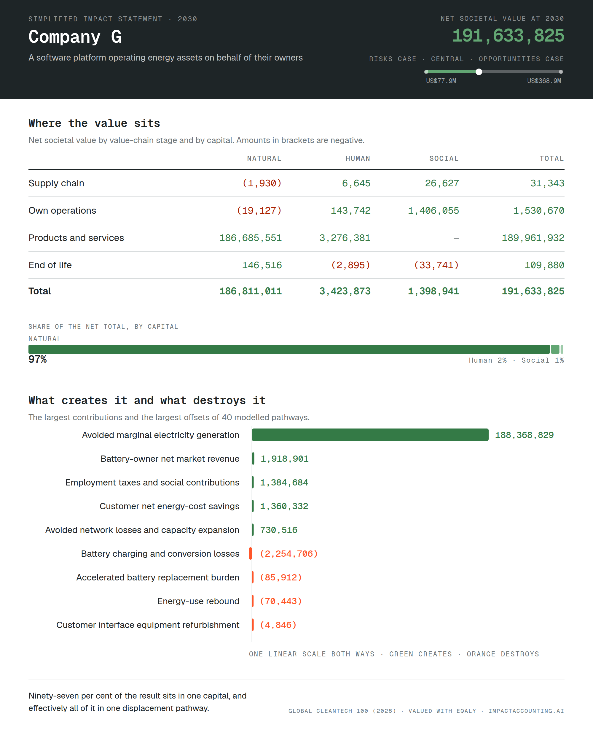
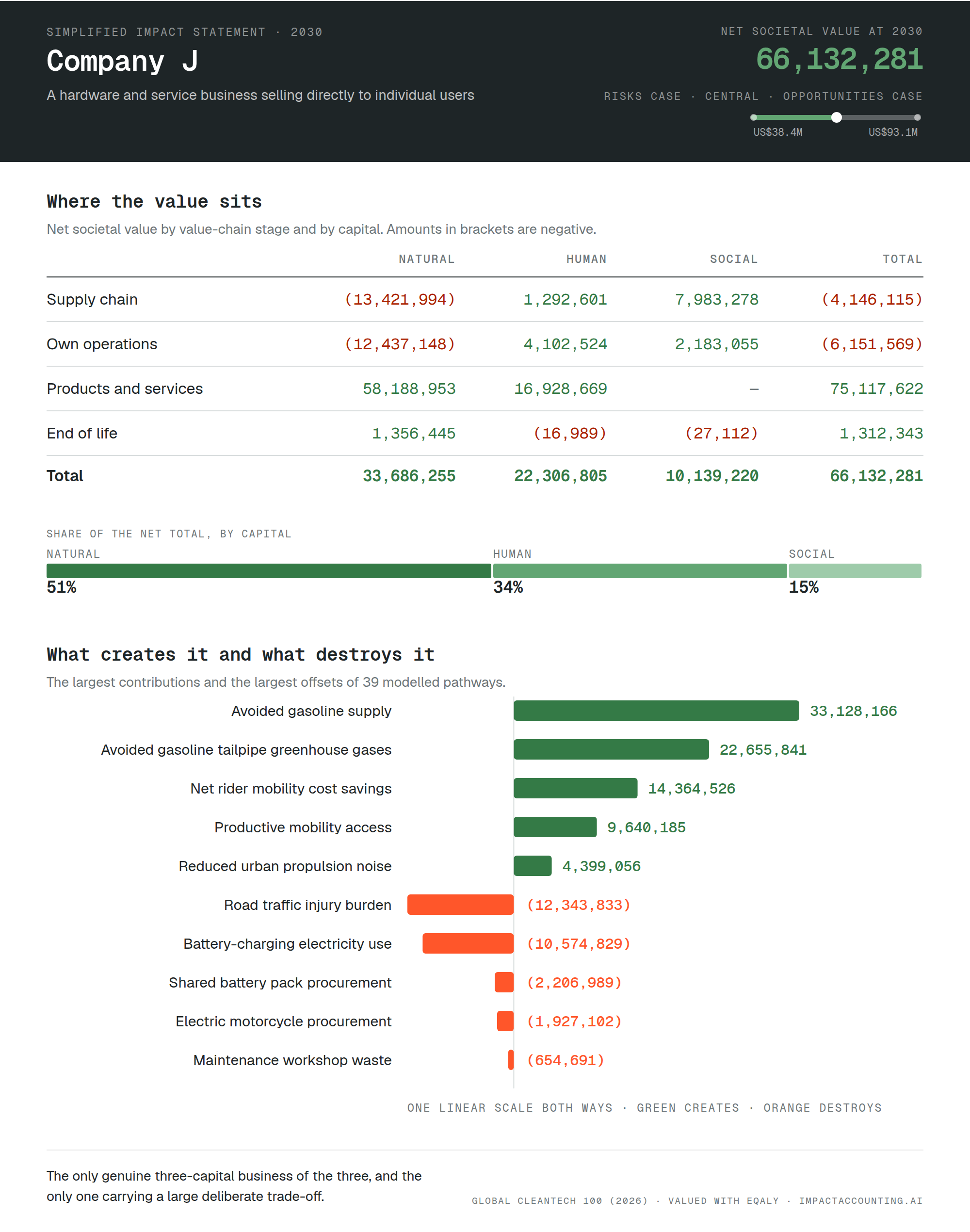
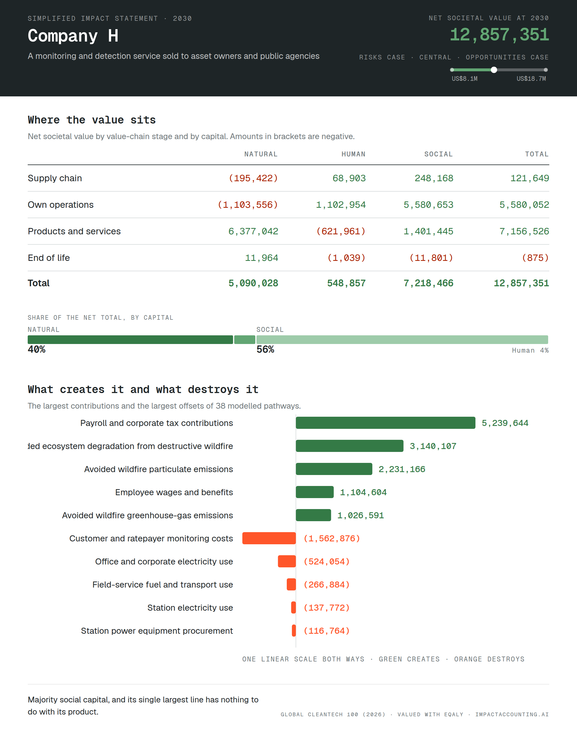
A societal value total is a summary, and summaries hide the structure underneath. Below are simplified impact statements for three of the cohort at 2030, laid out the way a profit and loss statement would be, with value created and value destroyed by value-chain stage and by capital, and with the largest contributions and offsets alongside. The three were chosen because they look nothing like each other, not because they rank highest. Figures are USD, and amounts in brackets are negative.
What the three statements show
Identifiers are consistent with the rest of the piece, and pathway names are the model's own labels. Read side by side, the three have almost nothing in common beyond the template.
Company G is close to a pure natural-capital business. Ninety-seven per cent of its result sits in one capital, it retains almost ninety-nine cents of every dollar of benefit it creates, and effectively all of it comes from a single displacement pathway in the use phase. Concentrated results like this stand or fall on one counterfactual assumption, which is where diligence belongs.
Company J is the only genuine three-capital business of the three, with roughly half its value in natural capital, a third in human capital and the rest in social capital. Two of its four value-chain stages are net negative, because it manufactures and it charges batteries, and one of its four largest lines of any kind is a harm its own model carries rather than a benefit. Road injuries are the price of putting more riders on the road, and the business is worth what it is worth after that price is paid.
Company H is majority social capital, and its single largest line has nothing to do with its product. Payroll and corporate tax contributions outweigh every environmental pathway it has. Its product benefit is ecosystem and health protection rather than carbon, which is why it ranks first in this cohort on health and wellbeing while sitting seventh on total societal value. A carbon screen would not find it at all.
The three totals differ by a factor of fifteen. The shapes differ by more than that, and the shape is the part a single number cannot carry.
Source: Global Cleantech 100, Cleantech Group. Valuation framework: eQALY, Valuing Impact 2026. Modelled in impactaccounting.ai.